Mallard & Sons
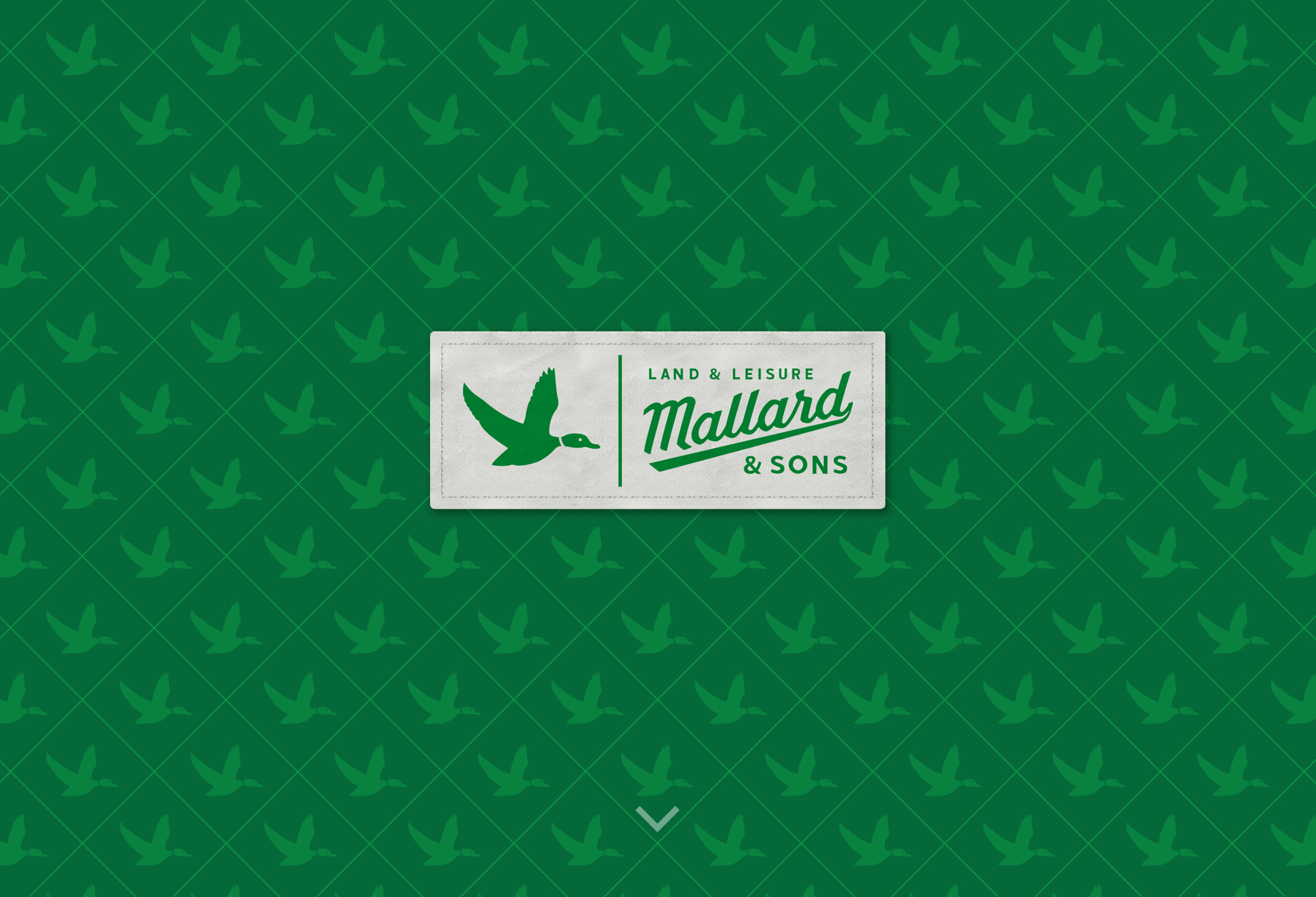
For this generational landscaping outfit, that cares as much about the land as the people who live on it, we invoked a timeless branding strategy. A bold, classic logo, iconic duck design, and custom scripted font really fit the bill (quack, quack). While a green and white color palette provided a “freshly” mowed feel. This is where timeless meets cutting edge and never goes out of style.
IDENTITY | DESIGN | BRANDING Photography: BrentHumphreys.com


